Development update December 2021
In case you are wondering what happened to this game after last summer, the short answer is that I had to take a break from development to focus on other stuff. The long answer is in this previous update.
This month I went back to work on Virtueror on December the 13th and despite the Christmas and New Year's break I managed to push the development forward a little in the last 3 weeks.
These are the main changes from this half month of work.
In-game currency
I introduced something that can be considered a new resource: money.
It is represented by the first icon from the left in the following image that shows the resource bar at the top of a mission screen.

For now players will only be able to use money to buy and to sell other resources.
I am not planning to let players use it to buy upgrades or structures as I believe that's something that should still require active work from existing game elements (ex.: some unit building a wall). I might experiment a bit with other uses though, like for example unlocking tech research that will give access to new upgrades.
New dialog for units and structures
I have completely redesigned the dialog to choose the unit (or structure) to create.
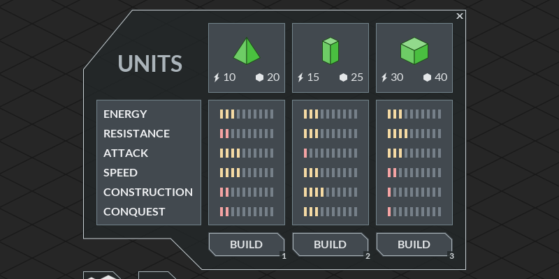
The old dialog was like this:

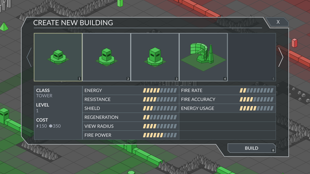
And the new one is this:

The old one was something quick I implemented to have something functional, but it was not supposed to be used in the final game as it was pretty limited and not designed for showing many elements.
The new dialog will allow to navigate through elements more easily and it can show more information at glance, which is something pretty important considering that now each unit has 11 attributes, whereas they were only 6 in the past.
Another major difference is that the old dialog was specific for units, but the new one will be used for both units and structures.
Unfortunately I haven't finished to implement this dialog yet, so for now I am only showing you a mock-up image, but I will make sure to include a GIF in the next update to show it in action.
Updated faction selection screen
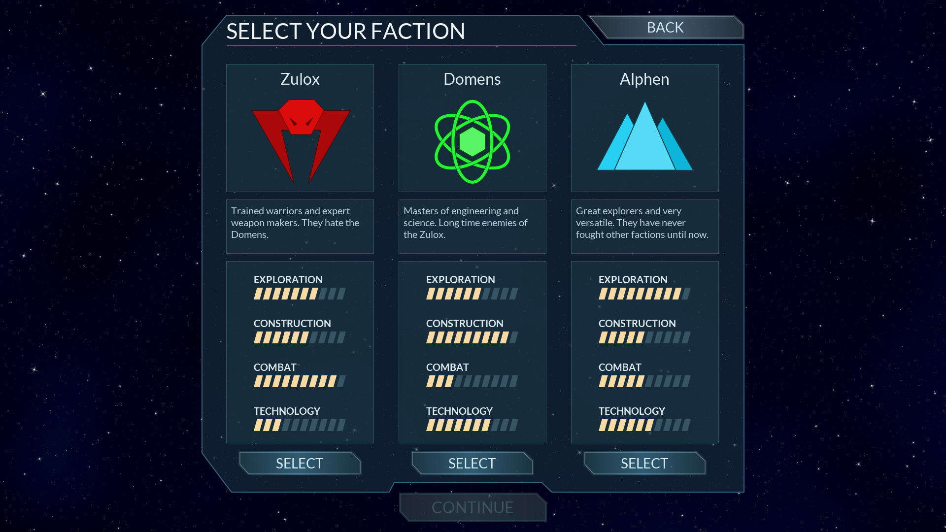
I updated the dialog of the faction selection screen to make it more consistent with the new in-game dialog.

In this case everything is already implemented as changes were minor. I also re-balanced the attributes of the different factions after noticing something was a bit off (one faction was slightly stronger than the others).
New selection highlight
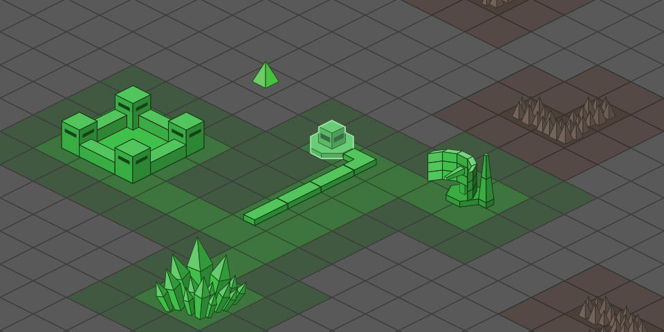
I changed a bit how selected elements look in game:

Before they only had a thick outline, whereas now the outline got a bit thinner and the whole element is covered by a semi-transparent light color.
A subtle change, but I can guarantee it makes easier to recognize selected elements.
Minor updates
During this period I also worked on other minor updates, like for example a new command to center the camera on the player's base and some work to improve and to simplify the UI system.
I normally don't post much details about these kinds of updates here, but if you are interested in knowing more about them make sure to join the official Discord server of the game and to check the #dev-updates channel.
What's next
I already know I will have to spend at least 1 week away from home this month, so I prefer to keep the planning pretty loose for now, but I will start finishing the new dialog, That will also require some work to adapt all elements to the new unified and extended attributes. Then I will probably spend some time on some mechanics to upgrade structures. Eventually I will start to work on new dialogs like the ones to trade resources.
More might come, but as I said, it's hard to plan things for now.
Support this game, add and follow!
If you enjoyed this update and if you want to support Virtueror I would really appreciate if you could spread the word, but also add it to your collections and follow me on itchio to stay up to date with all the upcoming news and updates.
Get Virtualord: The Virtual Conqueror
Virtualord: The Virtual Conqueror
A new-retro Turn Based Strategy game
| Status | In development |
| Author | Vivaladev |
| Genre | Strategy |
| Tags | 4X, Isometric, Low-poly, Roguelite, Singleplayer, Strategy RPG, Tower Defense, Turn-based, Turn-based Strategy |
| Languages | English, Spanish; Castilian, Italian |
More posts
- Dev Update: November 20258 days ago
- A new beginning: VIRTUALORD43 days ago
- Dev update December 2023Jan 03, 2024
- Dev update November 2023Dec 01, 2023
- Dev update Februrary 2023 & new alpha 0.1.2Mar 01, 2023
- Development update January 2023Feb 02, 2023
- Alpha 0.1.0 now available!Jan 13, 2023
- Development update December 2022Dec 30, 2022
- Development update March 2022Mar 31, 2022
- Development update February 2022Mar 05, 2022
Leave a comment
Log in with itch.io to leave a comment.